Tools You Need to Make Your Labels Stand Out
If you own a business, you cannot overstate the importance of labels in your branding and packaging. The image of your business is signified by its labels. It will work in your favour if they have a positive impression on your clients. Labels can come in all shapes and forms from your average drink labels to luxury candle labels.
But with the array of options available, it can be difficult figuring out where to begin when making your labels. To ensure that your labels stick out from your rivals and assist sell more of your products and services, follow these 8 tips:
Competitor Research
It is best to understand the measures other businesses are implementing before you begin devising anything. This will assist you to avoid making expensive errors. Examining your competition’s in-store advertisements, shelf placements, and pricing strategies will enable your business to be proactive instead of reactive.
Branding
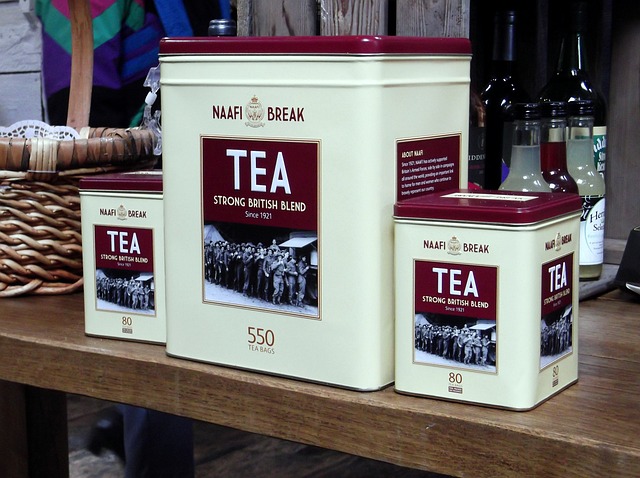
The first thing you need to do is ascertain that your label matches your packaging. It should signify both the product’s personality and the brand in general. You don’t want a soda label that appears to fit a hat box! And you ideally don’t want a cleaning solution or industrial solvent packaged in plain white; it won’t stick out to individuals. Include images and colours that are affiliated with the contents that are inside — for instance, green for cleaning products or blue for bleach — and complement it with your company identity. If done properly, this action will make sure that each time somebody catches a glimpse of your labels, they will likely come to a conclusion of buying your product again.
Colour
Colour plays an integral part in making a strong first impression on your clients.
The best method of thinking about colour in a product is an illustration. A good designer will apply various colour shadings to form the right impression and breathe some fresh air into their work. In the way they will apply a light shade atop a dark one to give off depth, so will a dark shade be used to have more effect and make your product stick out.
Fonts
Fonts bring with them some character as you can understand the branding or message before you’ve even taken in the words — they provide the platform for the words the reader is going to digest. Fonts create the first impression on your prospective customers, so identifying fonts that highlight the brand of your company is key. Go for a readable font in line with the identity of your brand like sans serif or Helvetica fonts for instance.
Readability
A label should ideally be readable and represent what your product is. The writings should move from left to right and relay its message. If the text is hard to read, or there are grammatical errors, chances are that users will steer clear of your product.
You don’t need to highlight certain information on your label. However, if you choose to add some info, it must be correct. There are various rules for retailers and products. Learn more about this in our FAQS.
Material
The label is an integral component of your packaging as it is the first chance for your brand to leave a mark. For this reason, you must ensure it is positive by selecting the proper material for your product! White, cream and clear materials provide a range of options when it comes to design and provides a high impact against a range of products. For instance, a clear label will be suitable for a green liquid; or a textured cream paper can give off an antiquated charm to labels used on wine bottles.